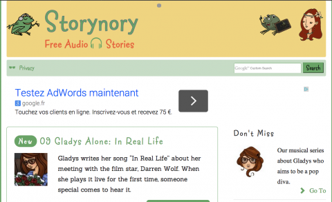
New Site Design August 2014

Wow! Storynory looks completely different.
The new design, as ever, has taken a huge amount of effort. We hope you will enjoy the benefits.
features
- Responsive – which means that the layout adapts for mobile and tablet
- Easy to read – generous font size, maximum line length for stories is about 14 words
- Cute icons – the work of Chiara Civati
- No clutter – everything easy to find we hope
- Playlists on archive pages – audio and download links directly in the categories, and when one audio stops, the next begins
- Stories in any order – browse the stories from first to last, or last to first
- Easy-to-find feeds for podcasts in all categories
- Much improved audio player – scrub backwards and forwards
We have loads of ideas for more tweaks, improvements and features, which will follow on.